Semantic Color
Semantic colors is a collection of colors used to represent common value states in user interfaces. Each color has the same basic meaning. In a design system, semantic color can be used to create a consistent visual language that is easily understood by users. It can be used to highlight important elements or information, create visual hierarchy, and guide the viewer's attention.
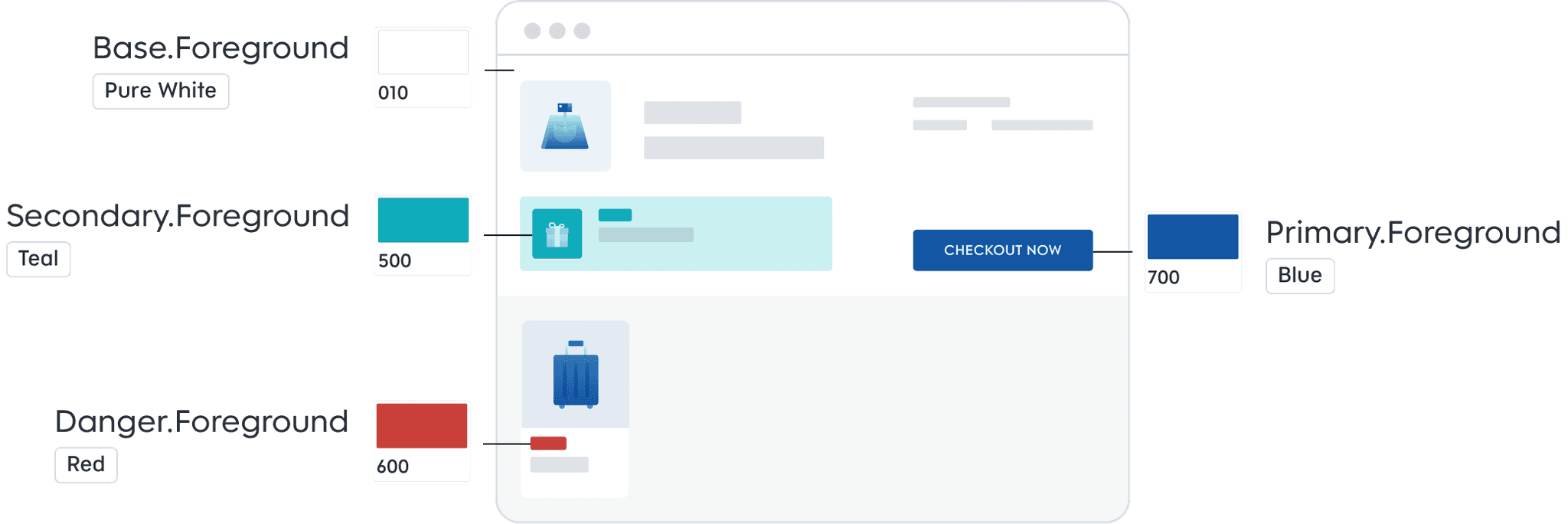
Primary Colors
The fundamental colors that form the basis of a color scheme and are used to establish the visual identity and branding of an organization.
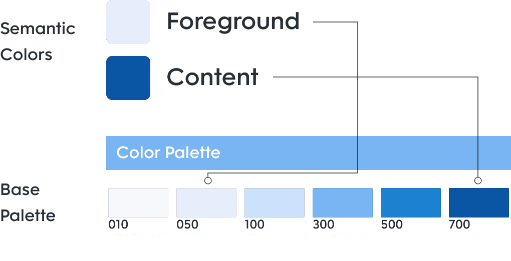
Color Modes
Semantic colors make it easy for designers to create new elements that are visually consistent with the rest of the app.

Primary Colors
The fundamental colors that form the basis of a color scheme and are used to establish the visual identity and branding of an organization.
Color Modes
Semantic colors make it easy for designers to create new elements that are visually consistent with the rest of the app.
Primary Colors
The fundamental colors that form the basis of a color scheme and are used to establish the visual identity and branding of an organization.
Color Modes
Semantic colors make it easy for designers to create new elements that are visually consistent with the rest of the app.
Functional Colors
Semantic colors make it easy for designers to create new elements that are visually consistent with the rest of the app.
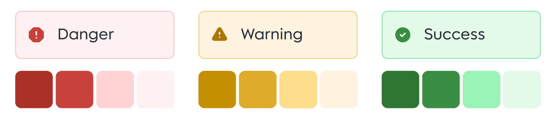
Danger
Set of colors that only apply to the background of any layer or frame in your design, but it cannot be used for stroke or text content.
Warning
Set of colors that only apply to the stroke of any layer or frame in your design, but it cannot be used for background or text content.
Success
Set of colors that only apply to the fill of text and icon (both lineal and filled style) in your design, but it cannot be used for background or stroke.
Functional Colors
Semantic colors make it easy for designers to create new elements that are visually consistent with the rest of the app.
Danger
Set of colors that only apply to the background of any layer or frame in your design, but it cannot be used for stroke or text content.
Warning
Set of colors that only apply to the stroke of any layer or frame in your design, but it cannot be used for background or text content.
Success
Set of colors that only apply to the fill of text and icon (both lineal and filled style) in your design, but it cannot be used for background or stroke.
Previous page
Next page
Previous page
Next page
Previous page
Next page
this is footer